
Starting to look into different scenery to work with, I decided to recreate the cityscape of Manchester in lines and blocks to keep with my designs. I don't think this piece works at all, it's far too blocky and the figure is almost engulfed by blocks and colour losing any shape, I think it's important to be able to see some of the body shape.
The addition of a human face from some of my earlier distorted face work, I also feel wasn't very successful as it just looks far too placed and doesn't really fit.


Creating more of a colour feel adding in background tones and shapes I think actually really works, and is starting to look more like a finished print. I like the addition of people in the print as it's as though the people are coming through the data, data is all around.

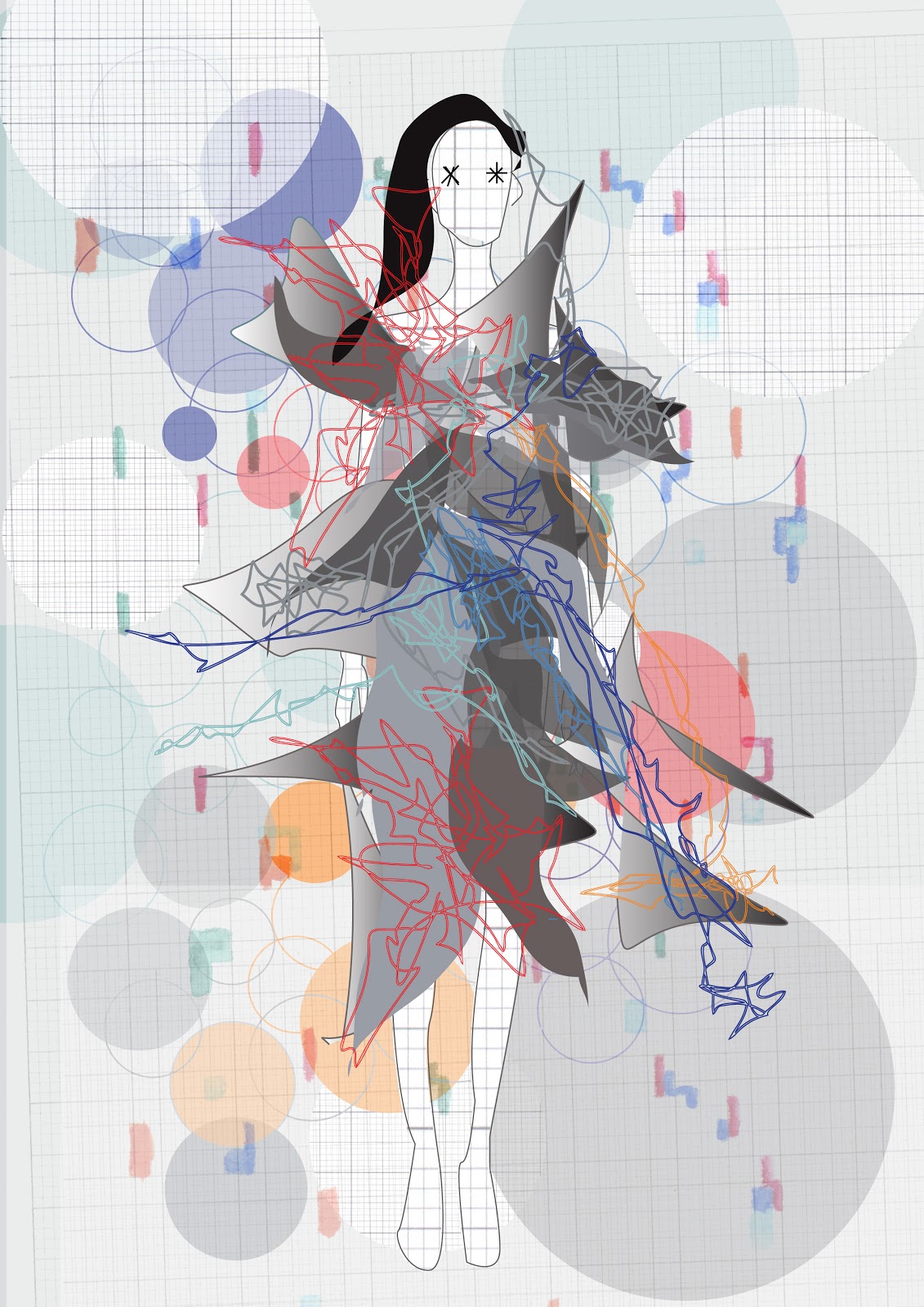
I've been adding hair back into my digital people which I think is starting to work really well, I'm still not sure about the distortion of the face, perhaps I should look back more and blocking off the face with bands and scribbles etc?
These backgrounds are perhaps too busy for the people, and a little too distracting from the data on the body.
No comments:
Post a Comment