Showing posts with label Locating Unit. Show all posts

Visualisations.


Here's a few of my visualisations as to how I can imagine my work being used within an interior context. 
These are quite statement wallpapers, so they would generally only be used as a feature wall, or as a panel.


Finalising Prints.


Here are a few of my more finalised digital ideas. This top design it one that I feel works particularly well, with the cream and white blending in together to create quite a subtle effect against the bolder cellular structure. 


They key to representing the 1950's style of design is definitely to keep the design simple. These I think work well as they don't involve many layers, just a top and a bottom to create a small amount of depth. 
The cream designs with bolder flashes of colour, I think are working particularly well. 


Sanderson.


Sanderson have done a range of 1950's inspired designs. The bold colours and abstract shapes used, work really well together. Repeat plays a massive part in most 1950's print, and Sanderson is no exception to this. 


Further Print.


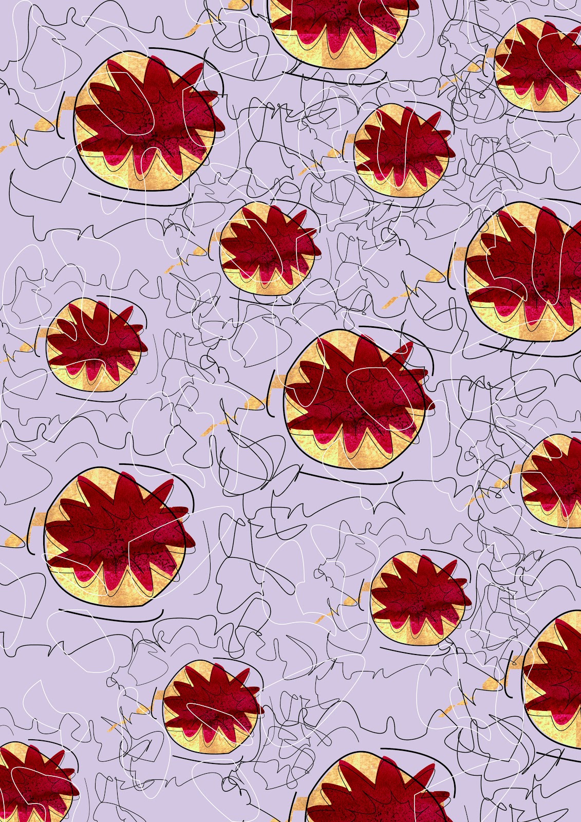
I've started to add other more simple element over the top of the prints, which I think are working really well. The pastel colours in the backgrounds combined with the more vibrant colours create a nice feel, which I think is definitely working well.


Initial Prints.


I tried out a few background patterns to start off with, however I think these top two prints would work well as stand alone prints as they are quite simple.
I need to remember to not get too complicated with this set of prints, as 1950's prints aren't very fussy. 


Illustrator Drawings.


I've been drawing cell shapes on illustrator to recreate the clean lines that are common in 1950's prints. 
I actually think these are really effective and are definitely the drawings i'll use in my prints.
I've added colour through photoshop, using various tools, combining areas of flat colour and also areas of textured areas to created different contrasts. 


Cells.


As the structure of DNA was realised during the 1950's I thought it would be interesting to make a link to this with my prints. I've been researching into cells, to take abstract patterns and shapes from.
I think this could be a really interesting angle of the 1950's.


Lucienne Day.


I really like the prints by Lucienne Day.
The abstract shapes are really interesting, and create quite a futuristic feel. The prints create quite clear lines combined with colour blocks.


1950's


I've been looking into possible colour schemes for the 1950's brief. I'd like to combine some of the pastel shades which are often dominant in 50's style print, with some brighter tones. I want to focus on bold outlines with colour fills to add vibrancy. 

Visualisations.


These are a selection of my visualisations, I think that the wallpapers actually work really well within the space, and create some nice effects when put into repeat. 
I'm pleased with how these have turned out.


Symmetrical Prints.


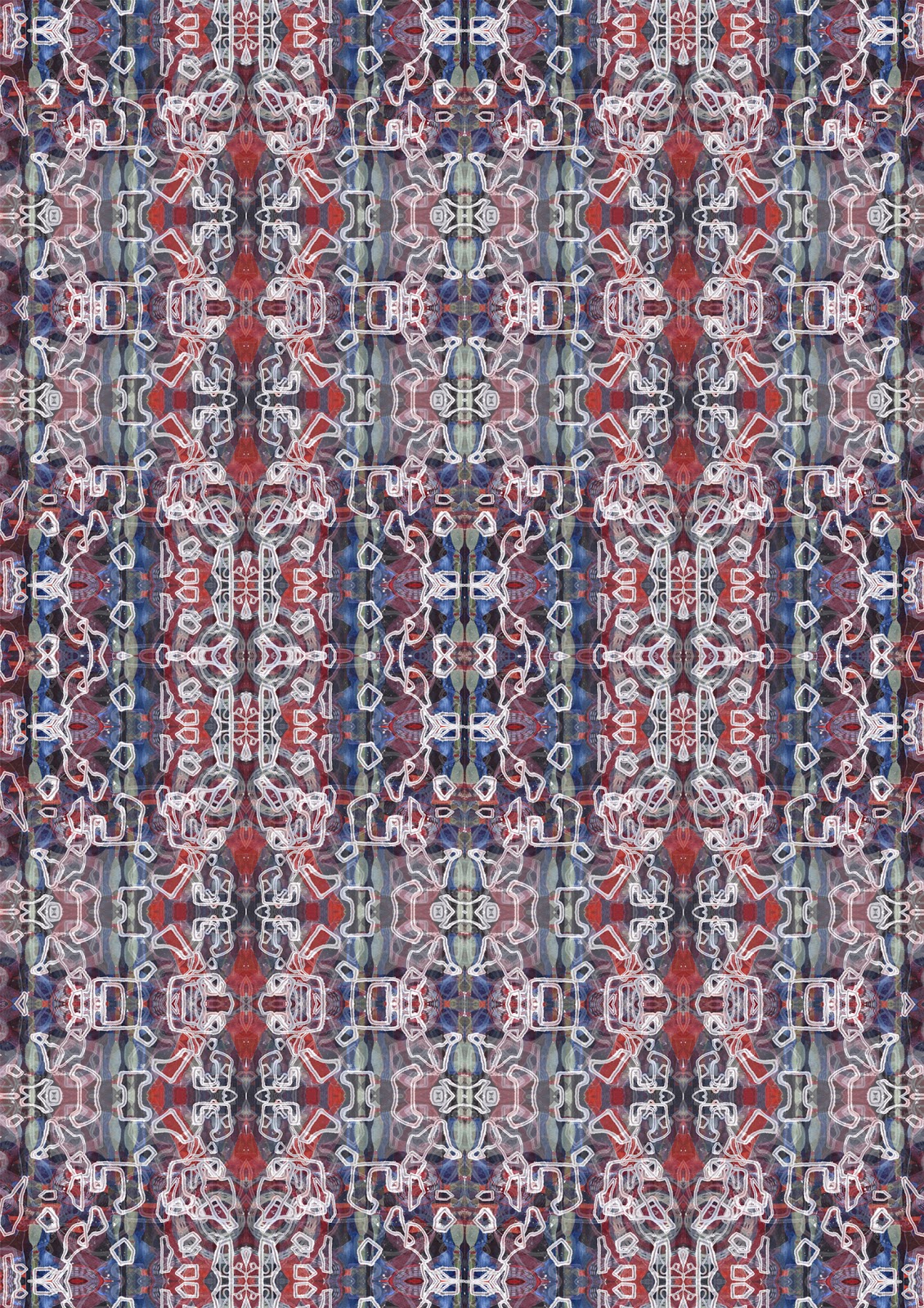
To further develop my initial print ideas I suddenly realised that the main thing I first noticed about baroque design and architecture was that everything was symmetrical and mirrored. Therefore I decided it would interesting to experiment with the mirror tool in photoshop. 
I found that this created some really interesting effects, and gave my prints a lot more finished and developed feel than they had previously. 
I think these are the designs that work the best out of the collection that I have created. 


Farrow and Ball.


Farrow and Ball create a large range of high end wallpaper designs, as well as paints and other interior necessities. 
This collection is from the baroque papers collection. These use elaborate and intricate designs to create a beautiful range of wallpapers. They are quite extravagant and capture the style of baroque perfectly.


Digital Prints.


I've started to play around with different layouts within digital print. Combining different colours and layers to create different effects.
I thought it was really effective adding back in the pencil line drawings over the top of the busier backgrounds. Changing the colour of the line, especially when the line was changed to white, created a nice effect and created a contrast between the background and the foreground. 


A variety of different options for my final collection would be good to show how flexible the prints can be. Some structured designs combined with floating shapes etc would work really well together.