Reflecting on the Project.


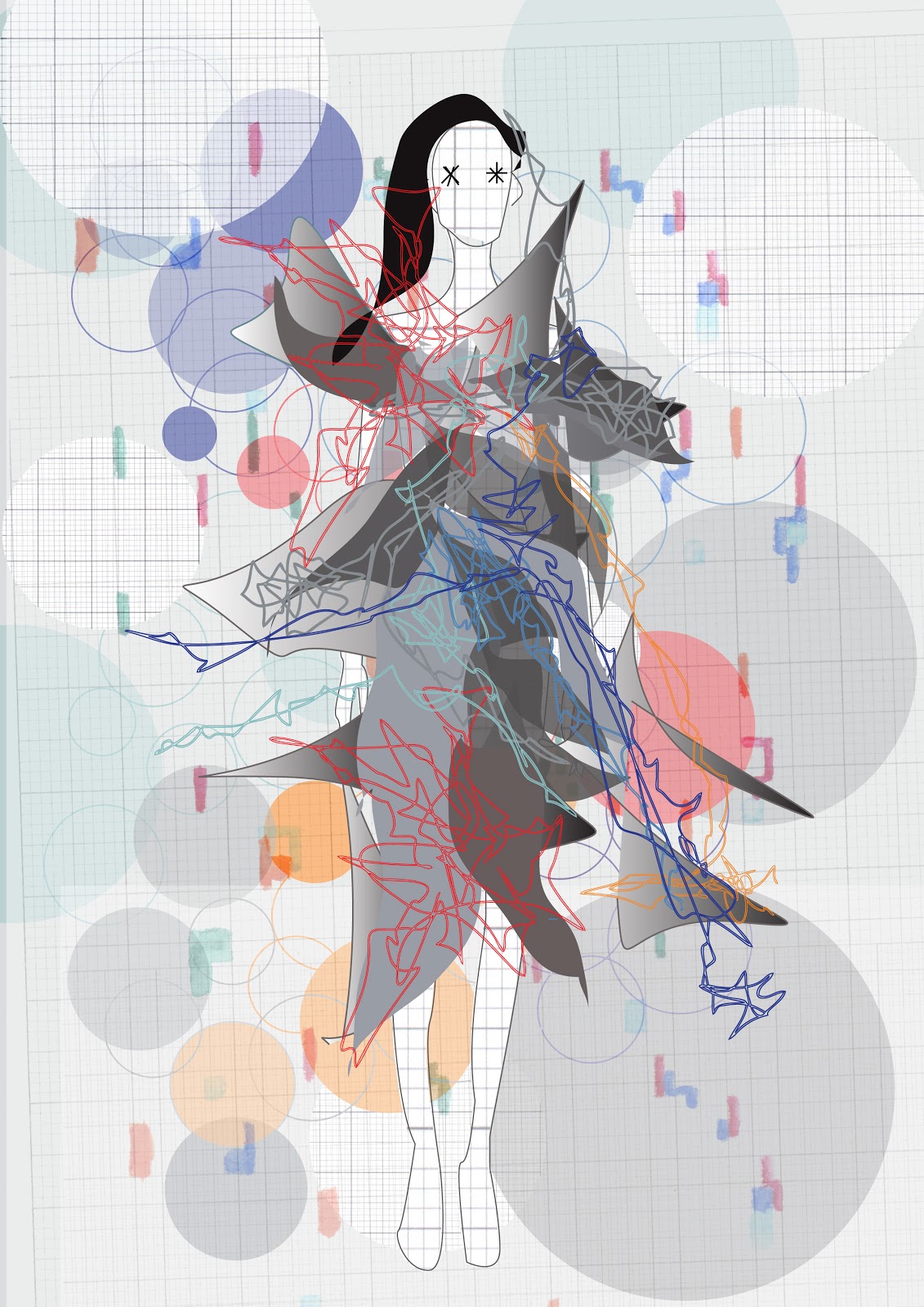
DATAWHERE was the name I came up for my finished books, this is a play on wearing your data, not knowing where your data is online and the fact that data is everywhere.
This project has been a tough one for me, and I've found it extremely challenging at times. Working to a more conceptual brief was hard for me at first, especially trying to come up with something futuristic to work with. I'm often quite a visual thinker and like to be able to draw from objects and places straight away, whereas this project was more about the thoughts behind the concept to start with.
I found that towards the end of the project I was trying to create prints from the data, instead of trying to get my concept across, which I think just shows that I am more of a visual worker as opposed to a conceptual thinker. I do however quite like the fact that the prints have more of a meaning, and perhaps in future I could come up with a meaning to start my project but then move into purely visual outcomes.
I have enjoyed working with a fashion based outcome, and it's perhaps something that I would like to explore further, perhaps I could design prints that are for both fashion and interiors.
Over the summer I would like to try and develop my use of illustration further and practice drawing the figure and garments, so that I can progress well into 3rd year.
This project has definitely pushed me out of my comfort zone and I'm glad a chose to do it, instead of staying where my comforts lie in interior surface pattern. My skills in Illustrator and Photoshop I feel have also progressed, and I've really enjoyed creating layouts and a final book. I think it's opened up my ways of approaching projects which should definitely be useful in 3rd year.

Final Layouts.


A few of my final layouts for the book, I think it's come together well in the end, I've tried to keep each page in keeping with eachother, having a theme running through the book. 
I decided to have two trend books, one that is for a more commercial audience with garment ideas etc, and another trend book which has more suggestive designs. 


Data Animation.


An animation seemed the best way to show my data moving and changing out of the book, a stop motion takes so long to create I didn't have to take this much further, but I think if I was to carry on with it, I would create a whole scene of people where the data was changing up and down to show how everyones data is different. 


Data Changing.


I've been testing out how I can show the data building up and changing, and I think this is probably one of the best way I can show that happening in the book. The city scene I feel is working really well and doesn't detract from the figures.
I think these can possibly be two layouts ready to put into the book as a spread against each other, which I think will work well. 


Tutorial Notes.

Final tutorial before deadline-
Laura
- a way of demonstrating changes- colours changing/levels of busy.
- maybe don't have an all over background.
- find a system of putting data on the body
- can you turn on/off?
- not on the front but on the back?
- how to layout?
- how changeable?
- methodical information
- do one or two pages to suggest to Alex.

Alex
- mood concept boards to start book
- key words/phrases to include?
- somewhere have overview of what sort of data has been used
- separate leaflet for the website- 2-D body work.
- showing how the flat image could work as a product.

Garment Suggestions on the Body.


I think again these backgrounds are a bit too busy, layering too much data into the background, however I do like this figure and think that skirt with the print works well, and also the facial distortion is starting to work slightly better I think.
The cityscape has definitely been the most successful background of my recent prints, so this is something I need to come back to.


Backgrounds and Colours.


Starting to look into different scenery to work with, I decided to recreate the cityscape of Manchester in lines and blocks to keep with my designs. I don't think this piece works at all, it's far too blocky and the figure is almost engulfed by blocks and colour losing any shape, I think it's important to be able to see some of the body shape. 
The addition of a human face from some of my earlier distorted face work, I also feel wasn't very successful as it just looks far too placed and doesn't really fit. 


Creating more of a colour feel adding in background tones and shapes I think actually really works, and is starting to look more like a finished print. I like the addition of people in the print as it's as though the people are coming through the data, data is all around. 


I've been adding hair back into my digital people which I think is starting to work really well, I'm still not sure about the distortion of the face, perhaps I should look back more and blocking off the face with bands and scribbles etc?
These backgrounds are perhaps too busy for the people, and a little too distracting from the data on the body.