Photo Combinations.


I've been combining different photos together by changing the opacities on different layers to create different effects. This top photo is my favourite as I really like the spectrum of colours that are coming through.


These photos in different sections have made me think about the possibility of using illusion to create imagery that appears different at other angles of perspectives, changing the meaning of the image etc. 
These images confuse slightly as looking quickly the bold yellow flower stands out and almost appears as if that is the image, but on closer inspection there are lots of other elements combined within the image. 


Layering and obscuring.


Layering up my drawings to obscure the identity of the pattern, I began to notice small faces within the print, which was completely accidental, perhaps this could be something to play with, hiding elements within the print? 


I've begun to experiment with colour, taking my photos and drawings and combining the colours and tones together..I'm not really sure about this piece, I quite like the vibrant pink within the white and brown, but I don't think this is quite the effect or colours that I'd like to focus on. 

Mary Katrantzou Resort 2014.


Looking through the collections on Vogue UK I just love Mary Katrantzou's latest Resort collection for 2014. Using her her classic style of clashing sections of print, Katrantzou has combined florals with architectural elements, and even where the print is more architectural influence there are still flashes of nature involved. It's all a bit surreal and the landscapes she creates with her juxtaposition of imagery are great. 
The main thing that strikes me about Katrantzou's work, and throughout this collection, is her use of colour, soft tones and vibrant flashes, everything works together harmoniously, each colour setting of the next.
I love how vibrant the collection is, and even with use of such bold colour, it's done in such a clever and thought out way that the colour isn't too in your face bold. 


All images courtesy of Mary Katrantzou for Vogue
http://www.vogue.com/fashion-week/resort-2014/mary-katrantzou/review/ 


More Drawing.


I decided to draw this plant as I loved the range of different marks it involved, areas of high and low density, different shaped and sized sections, it had a great variety of things to focus in on. 
I drew the marigolds below as I liked the fluidity of the line creating a ruffled texture. 
I don't want to keep these images as whole flowers, I only want to use them for their patterns, I think it'd be interesting to take these apart in photoshop and put them back together again in a different way. 
Hiding and changing the identity of the pattern. 


Cannon Hall.


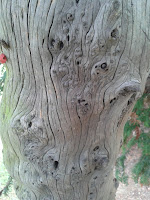
I visited Cannon Hall to take a wander round it's extensive grounds and gardens. I wasn't particularly expecting to find anything that would inspire me, however it became a great opportunity to take close up photos of the plants, which zoomed in on have some great patterns and textures on them. As well as that I came across this dead tree, which had fascinating patterns all along it.


These two are my favourites from the collection that I took, I just love the swirls embedded in the grain of the tree, all the bark had fallen off and these were what was left if its place.


There were some other interesting examples of patterns in bark, with the tree on the left appearing to almost look like cooled lava, and the tree on the right having small circles and spirals all along it. 


Digetex Placement.

http://www.digetexhome.com/

During the summer I undertook a 3 week placement at textile printers Digetex in Manchester.
I was unsure what to expect and what I was going to be asked to do. I was really looking forward to being able to get hands on experience within a textile printers, and that's exactly what I got.
I gained experience in all aspects of the business, which I didn't think I would be able to do, I mainly thought that I would purely be based in the studio. However I was able to gain experience in the factory , customer services and of course in the studio.
I really enjoyed being able to see the process of the printing in the factory, seeing first hand how they check the fabric, coat it, print it and then wash it. There was a large order whilst I was interning that needed to be finished the next day, so I was able to lend a hand printing on the heat press and cutting and finishing various bits.
I was also asked to help out on the phones for a few days, this taught me valuable customer and communication skills, and once I got the hang of the phone switch board I did enjoy it.
Helping in the studio was the main part of the internship, I helped source room sets to be used for various collections, I then produced a range of visualisations using the rooms that I had sourced.
I was asked to use some of their designs to be put onto a new range of cushions, experimenting with different compositions and layouts to create the new collection. I also helped out with imagery for the new website and with sending out samples to new customers.
This was a really hands on experience, where I got to see every aspect of how the company was run, it was great to be able to meet the people in each department as they could each teach me different things about the business. I enjoyed seeing all the different ranges of fabrics, designs and clients they were printing for whilst I was there. It was a real eye opener into the commercial world.

Matthew Williamson for Osborne & Little.


I came across Matthew Williamson's new collection for Osborne & Little in the September issue of Elle Decoration. I was drawn to the extravagance of the collection, with exotic peacock, bird and tiger prints, with jewell tones and flashes of metallic. 
I particularly like the painterly qualities used with the sunbird prints. 
Blue and green tones are very popular for the new season, and I'm definitely very drawn to using them within my work. I need to pay more attention to colour work this project. 


Eden collection- Sunbird
http://www.osborneandlittle.com/products-and-collections/wallcoverings/autumn-2013/eden-wallpapers/sunbird


Eden collection- Peacock
http://www.osborneandlittle.com/products-and-collections/wallcoverings/autumn-2013/eden-wallpapers/peacock


Eden collection- Tyger Tyger
http://www.osborneandlittle.com/products-and-collections/wallcoverings/autumn-2013/eden-wallpapers/tyger-tyger


Photo Combinations.


Combining different parts of photographs together to try to create new ideas for compositions. I think that i'd like to try and layer up photos in photoshop to reveal different sections by changing the opacities. Need to have a play around really. 


Camouflage Photography.


Liu Bolin is a Chinese artist who camouflages himself into photographs, he works on each piece for a around 10 hours, and often people will not notice he is there until they run into him.


Desiree Palman is a Dutch artist who also uses camouflage photography, spending hours hand painting cotton suits to match the backgrounds of her photographs. 


All images from http://www.webdesignerdepot.com/2010/02/the-hidden-art-of-camouflage-photography/ 


Tree Stumps.

It was interesting to try and draw these tree stumps with all the different gradients in colour, the different marks and textures and of course the tree rings. 
Building up a base of original drawings I think is important, especially as it is often something I don't spend enough time doing, I've enjoyed taking my time to draw these in greater detail than I would usually allow myself to. I often like to take an abstract and loose approach to drawing, but sometimes it's all in the detail!

Illustrator Lines.


I tried experimenting with tracing over one of my photos of the tree bark on illustrator. I'm not entirely sure I like them, but I could perhaps combine elements of digital and hand drawn line. At the moment I definitely think hand drawing is the best way to capture the marks and texture of most things in nature. 
I did try a few tools on illustrator to see what they would do to the image, one of them was the blend too, which made all the lines multiply, I quite liked the effect of this, the pattern has become more intricate. 
The trouble with drawing digitally is the drawing often looks better on the computer than it does on paper.


Drawing drawing.


I've enjoyed taking back my drawing to purely black and white and using marks to represent the bark and the markings of the tree. I think this is something that I can then take into photoshop, experiment with adding colour back in etc, just to have a play around with really. 


I wanted to combine different patterns, so taking strips of all the photos I've been gathering I continued out the drawings to create lots of different patterns and combinations, this is just one half of the strips taken from my sketchbook. 


Tree Rings.

I've been looking for trees that have been cut down to leave the stump behind so I can have a look at the tree rings. As luck would have it, a neighbour  had some trees cut down and all the stumps were in a pile outside the house, so before they took the stumps away I took some photos!